Thursday, April 06, 2006


Getting Literary…

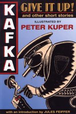
GIVE IT UP! and Other Short Stories
Written by Franz Kafka
Adapted and Illustrated by Peter Kuper
Published by NBM


Now on its fourth printing, this NBM collection has clearly struck a chord with readers. Kuper, who also adapted Kafka’s THE METAMORPHOSIS, doesn’t really do a straight translation of Kafka’s short work here; instead, what he depicts is almost an impressionist take on the classical author’s work.

Kuper’s artistic style is very bold and striking; knowing that the work will be published in black and white, he uses that to his advantage in these pages. Much of Kafka’s work was drenched in darkness and despair, and Kuper embraces it by using the inks on the page in smooth concert with the open areas to allow the negative space to tell as much of the story as the delineated art does. It’s an effect that few artists do well (Frank Miller being one of the obvious exceptions), but Kuper is definitely one of them.

My reaction to the rest of the book isn’t necessarily enthusiastic as it pertains to story execution, however. I understand that Kafka’s works resist literal translation to the sequential format; at the very least they’d be a little dull. But at times it feels like Kuper takes his impressionist act a little too seriously, and some of the stories get loose in the delivery. However, when Kuper puts the focus to material, like “The Hunger Artist”, the book sings and displays an amazing vitality.

In the absence of series like CLASSICS ILLUSTRATED, only NBM seems to be taking aim at the literary graphic novel market. Books like GIVE IT UP! have an important niche to fill in the market, and it’s gratifying to know that there’s enough of an audience for them to require multiple printings. This book wasn’t my cup of tea for the most part, but I respect the effort and concept.

/Mason

Tuesday, April 04, 2006


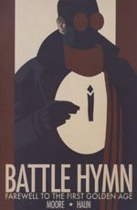
BATTLE HYMN VOL.1
Written by B. Clay Moore and Drawn by Jeremy Haun
Published by Image Comics


BATTLE HYMN was a book that I ran hot and cold on as it shipped its individual issues. Installment one seemed to be trying too hard to “darken” the classic INVADERS or ALL-STAR SQUADRON concept and lacked interesting characters. By issue three, I’d softened on it, believing that Moore and Haun had done a decent job of carving out their own niche with the archetypical characters. But as issue five concluded, I felt like they had rushed through the story and closed with an unsatisfying ending. So taken together as a whole, how does it read?

Pretty much like the individual issues did: inconsistent, and somewhat frustrating.

Seeing the story collected and reading it in one sitting, the issues with pacing become much more apparent. By the time the end of the series rolls around, you feel a bit like it needed another issue to flesh out the characters and make the tale feel more complete. Characters come and go, and much of the motivation of the background players (i.e. the government types who put the team together) is fuzzy.

The Captain America. The Union Jack. The Namor. The Human Torch. The Whizzer. The types we’re all familiar with are here, and set against the Nazis in the Second World War. But in Moore’s take, they’re mostly sleazy and un-heroic, plus they get their own hooker who sleeps her way through the team. Not quite Roy Thomas, is it? But throw in a conspiracy angled towards an unknown goal and the lack of an obvious reason for the team to be together, and you have genuine intrigue.

Part of the issue is that there’s no real perspective from where the tale is told. Betty, the hooker, is the add-in, but she’s vacant except for her sexuality. The one heroic character, the Mid-Nite Hour (the British hero), is never quite given as much to do as you’d like, rendering him sort of impotent as far as affecting the story. His purpose seems to be mostly observational, which is deliberate as far as the plot goes, but that prevents him from giving the reader the foothold so desperately needed.

If I were looking at BATTLE HYMN from a cynical point of view, I’d question whether or not it was a deconstruction of the archetypal stories from the Silver Age or simply a middle finger extended in their direction. In my final analysis, though, I don’t think that Moore was aiming for cynicism, so much as he was hoping to ground the comics that he loved from his youth. But whether or not he had purity in his purpose, BATTLE HYMN doesn’t quite reach the mark he’s targeting, despite a number of fine elements (including Haun’s art) that get him in the nearby zone. Noble effort, misguided result.

/Mason

Monday, April 03, 2006


GETTING BACK TO IT (I HOPE)

Just because I’m not over-extended enough, check out the new version of the Comic Foundry; you’ll see me there monthly doing my new column “Buy The Numb3rs,” playing swami and trying to guess sales numbers.

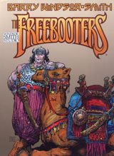
THE FREEBOOTERS
Written and Drawn by Barry Windsor-Smith
Published by Fantagraphics


FREEBOOTERS is one of the more high-profile “rescue” projects undertaken by Fantagraphics in the past couple of years. After Windsor-Smith’s STORYTELLER was unceremoniously under-promoted and under-noticed while being produced by Dark Horse, the series and the material languished and the creator stewed. Enter the fine folks in Seattle to take the reins and get the work back into the public eye.

Windsor-Smith became a household name in comics by drawing a barbarian; Conan to be exact. He’d move on to a variety of other projects, and return to the concept of traveling barbarian warriors in the early 90s with ARCHER AND ARMSTRONG. Clearly, the milieu suits his eye. STORYTELLER contained three series within its pages, and FREEBOOTERS, his latest take on ancient warriors was a big part of it. The set-up is pretty simple: young warrior Aran has had a vision detailing the end of the world. The last time this evil surfaced, it was dispatched by Axus the Great, so he heads off to the big city to find Axus and draw him into the fray. What he doesn’t know, however, is that Axus has gotten old, fat, and drunkenly stupid… and that he licenses his name and image to idiotic pretenders so he can rake in some extra coin.

Printed in an over-sized format and in luscious color, FREEBOOTERS is Windsor-Smith’s finest comedic work. Rather than take things too seriously, even when dire moments occur in the story, he throttles back on the angst and lets the natural humor of his loutish hero take control of the story. The best sequence in the book finds Axus aggravated by the arrival of another warrior who happens to be everything Axus isn’t: young, in-shape, and stout. So in a fit of self-loathing, the modern pirate decides to take his friends and rob the local governor (known as the Kalif). Unfortunately, this spells trouble, because he not only chooses to do so on a night when many people have entered his tavern in other to hear him discuss his adventures… but he has painted “The Kalif is an asshole” on the side of the balloon he puts his men in for the attack… and misspelled “asshole.” It’s a gut-busting series of scenes that still keep a slight dramatic undertone as the threat to the world finds its way into the night’s pillaging.

I’ve long admired Windsor-Smith’s work, and he remains one of the most distinctive creative presences on the shelves. Fantagraphics has treated him right with this excellent book design and packaging, and I certainly hope that someday we’ll see more work from him in this format. He’s one of the real legends in the biz, and he certainly deserves it.

/Mason

Monday, March 13, 2006

SINGLES

Gotta start trying to get the pile back under control.

FELL #4
Written by Warren Ellis and Drawn by Ben Templesmith
Published by Image Comics


It’s a joy to see a new issue of FELL arrive, because the series not only started out strong (and made my top ten list in 2005) but it’s remained strong. In fact, in sixteen short pages, Ellis and Templesmith somehow seem to be able to present more character growth and nuance than many creators do in six-issue arcs. This issue finds Richard Fell investigating a random body dump in the river. Discovering that they are considered low-priority cases and never solved, he takes it upon himself to solve the current one, just to prove that it can be done. What makes the story excellent isn’t the resolution, which is sort of rote; instead, it’s the discovery that Fell is a man of ethics… but not necessarily an ethical man. That subtlety is what makes this book brilliant.

INVINCIBLE #29
Written by Robert Kirkman and Drawn by Ryan Ottley
Published by Image Comics


Over the last few issues INVINCIBLE has ground to a seeming halt. If it hasn’t been the release schedule dragging at the book, it’s been the pace at which the story has moved (the tortoise has been kicking the book’s ass in a footrace). Issue twenty-nine begins to address at least one of those problems; after many issues, we finally get to the big battle we’ve been promised pitting Invincible and his estranged father against the finest killer warriors their home planet has to offer. It’s a violent, brutal slugfest that harkens back to the father/son fight that capped year one on the book. Fortunately, Kirkman delivers some emotional impact to go along with the battle, and the book feels like it works for the first time in ages. We’re still far away from what made the book great to begin with, particularly the supporting characters back on Earth, but on the surface it seems like maybe INVINCIBLE is ready to return to form.

PLANETARY BRIGADE #1
Written by Keith Giffen and J.M. DeMatteis and Drawn by Various
Published by Boom Studios


BRIGADE is an amusing semi-prequel to the writers’ smash series HERO SQUARED. The common link is Captain Valor, something of a Captain Marvel/Superman pastiche who eventually makes his way into a different dimension where there are no super-powered beings at the beginning of SQUARED. However, this story takes us back earlier in his career to where he was aligned with his planet’s mightiest heroes, the Planetary Brigade. If you’re asking yourself if they resemble the Justice League a smidge, you get a gold star. The primary threat the team is facing is a poor guy whose body is being used by a nasty bunch of demons to invade the Earth, but the primary purpose of the story is for the dynamic writing duo to have a lot of fun, and they succeed. Nothing here will shock you with its originality, but like a comfy shoe, the work of Giffen and DeMatteis fits and brings on the smiles.

WAR OF THE WORLDS: SECOND WAVE #1
Written by Michael Alan Nelson and Drawn by Chee
Published by Boom Studios


On the flip side, this is precisely the sort of homerun I’ve come to expect from Boom’s publishing output. By turns scary, exhilarating, emotionally intense, and unpredictable, SECOND WAVE has more depth (and a much more interesting lead character) than the Tom Cruise vehicle that populated theatres in the summer of 2005. Miles is an everyday schmoe who loves his wife and lives a quiet suburban existence until one day aliens land and he makes a choice that destroys his life. And in the throes of his pain and guilt, he begins to find an inner-self that he didn’t know existed. All he lacks is the ability to redeem himself. Unfortunately, when the invaders are felled, he loses that chance. However, diverting from Wells’ classic novel, one simple question was always left unanswered: what if the Martians developed a vaccine for what brought down their first invasion? Miles and his prayers for revenge are about to find out. SECOND WAVE is uniformly excellent, a cold splash of water on a hot day. I’m fascinated to see where the series will go.

/Mason

Friday, February 24, 2006

IF I DIDN'T HATE TO FLY...

This would be damned cool:

Kyle Baker to be Harvey Awards’ Master of Ceremonies!

9 days left (March 3) to submit Harvey Award Nomination Ballots!

Kyle Baker, recently named as a guest of the 2006 Baltimore Comic-Con, has been announced as the Master of Ceremonies for the Harvey Awards, to be held Saturday night, September 9 in Baltimore, Maryland. Kyle Baker is a Harvey and Eisner Award winning author and illustrator.
Baker is the creator of nine Graphic Novels: YOU ARE HERE, WHY I HATE SATURN, THE COWBOY WALLY SHOW, KING DAVID, I DIE AT MIDNIGHT, UNDERCOVER GENIE and Plastic Man On the Lam for Vertigo/DC Comics and CARTOONIST VOLUME 1 & 2 through his own press, KYLE BAKER PUBLISHING.

“As a creator, Kyle Baker has an impressive, eclectic body of work ranging from superheroes to the sublime, including high profile work for Marvel and DC, his own independently published projects, and multimedia work for HBO, Disney, Warner Brothers, and DreamWorks.” said Baltimore Comic-Con promoter Marc Nathan. “Having seen Kyle accept industry awards and having read his work, we think he will help us to present a funny, engaging awards show. He’s an excellent representative of the industry, and we’re thrilled to have him as the MC of this year’s Harvey Awards.”

The awards are named for Harvey Kurtzman (1924-1993), a cartoonist, writer, editor, and comics genius. The Harvey Awards recognize outstanding work in comics and sequential art. They will be awarded in co-operation with the Baltimore Comic-Con on September 9, 2006.
The Harvey Awards Nominating deadline is March 3, 2006. Ballots are still available at www.harveyawards.org and can be submitted via ground mail or electronically. Nominations for the Harvey Awards are selected exclusively by comics creators - those who write, draw, ink, letter, color, design, edit or are otherwise involved in a creative capacity in the comics field. They are the only industry awards both nominated by and selected by the full body of comic book professionals.

For additional information about Kyle Baker, visit www.kylebaker.com

For additional information about the Harvey Awards, visit www.harveyawards.org.

For information about the Baltimore Comic-Con, visit www.comicon.com/baltimore.

Monday, February 20, 2006

SWINGIN’ SINGLES

So, last week Warren Ellis made his case for calling the standard 32-page comic a “single” rather than “floppy” or “pamphlet.” And while I generally am not in favor of ankle grabbing for British men with frightening beards (or any other type of man), I’ll give it a shot just this once.

SEASON OF THE WITCH #3
Written by Jai Nitz and Drawn by Nicola Scott
Published by Image Comics


Young Jessica’s growth into a hero of great stature reaches its apex as she takes the battle to free the peasants to the King himself. But even if she succeeds, that may not satisfy her mentor; her methods have gotten a bit extreme, and he fears that he has created a monster.

I’ve enjoyed each issue of SEASON to date, and this one was really no different, though the change in artists definitely hampers the book. The brilliant Kevin Sharpe is gone, and while Nicola Scott turns in some nice artwork, some of the zest that made the characters jump off the page in the earlier issues is missing. Still, I think Nitz does a terrific job of allowing the reader to decide for himself whether or not Jessica is truly out of control or just assuming the role of savior in the way that most people would. I’m looking forward to seeing how he concludes matters.

INTIMIDATORS #2-3
Written by Neil Kleid and Drawn by Miguel Montenegro and Cafu
Published by Image Comics


I was mezzo-mezzo on the first issue of this title, as it didn’t really allow Kleid to tap a deeper satirical vein; it was mostly set-up. Fortunately, that problem gets rectified in the next two issues, as goody two-shoes hero Astroman arrives in the present and finds himself dropped into the middle of a battle featuring the sickly violent and perverse Intimidators. Then the fun really starts. But first, we also get a hilariously executed flashback of Astroman’s final days in the past, right down to simpler art and yellowed pages. Good stuff.

As the poor bastard wakes up in the present, he discovers that today’s heroes are crude, drunken, vile people, and he’d just as soon not stick around. But rather than head back to the past, he’s saddled with trying to turn the twistos into true good guys. However, just learning about who his teammates are in their off hours might give him a heart attack and kill him. After all, no heroines from the sixties had a website that sold self-created porn.

Telling you too much more about the beautiful nastiness in these two issues would spoil the fun. Suffice it to say, this was much more what I was expecting when the book was announced. I’m not sure that “fun” is the best word to describe this comic (unless you’re someone who gets sent to solitary with some frequency), but it’s in the ballpark.

DEAD @17 PROTECTORATE #3
Written by Alex Hamby and Drawn by Benjamin Hall
Published by Viper Comics


This DEAD prequel (the first series under the title not written or drawn by creator Josh Howard) concludes on a startlingly grim and harsh note. What looked in issue one to be a bit of a fluff, and soft excuse to have the girl with the huge rack on the cover running around in a nightie, ends as a tale grounded in a sense of the hopeless. And you know what? That was just surprising enough to make me give it a passing grade.

One thing I will say: I missed issue two, and the lack of any sort of front cover recap just about killed my ability to understand what was going on in the book. Even parsing out some of what was happening, there was plenty at work here where I could have used the help, and I think anyone picking the book up off the shelf in a comics shop would have enjoyed a recap as well.

Hall’s art looks a bit more confident in this final issue. Grace is drawn in a bit less cheesecake fashion and more towards having the ordeals in the miniseries having stripped away her innocence. The ending also does finally come around to letting a sliver of light shine on the proceedings, so there is a sense that the series does truly have purpose as pertains to the DEAD universe. All things being equal, this turned out better than I anticipated.

MEGACITY 909 #8
Written by Jacob Lee and Andrew Dabb and Drawn by Kano Kang and Zack Suh
Published by Devil’s Due


I managed to miss the concluding issue to MEGACITY when it came out, but thankfully, the magnificent Susan Bishop at DDP was able to help me out. This was a book that I personally enjoyed a great deal; it was off-the-hook crazy, running the gamut from working as a military action yarn featuring demons as the enemy to taking the characters to Hell to the near-destruction of the world. Crazy, manga-flavored insanity where just about anything could happen and generally did. I can’t get enough of comics like that.

Issue eight fell right in line with the rest, delivering over-the-top moment after over-the-top moment. Miniature nuclear weapons against the hordes of Hell. Possessed good guys. Heroes sentenced to new lives as carriers for demonic entities. And the creative team is promising more down the road. That’s just news to my ears.

MEGACITY 909 never seemed to become the “buzz” book that it deserved to be, but I think that with a good trade edition and some solid promotional efforts, the next go-around for these characters might get its due. If you’re a fan of books like THE ULTIMATES and THE AUTHORITY, then this is a book you should be onboard for.

BLACK HARVEST #3
Written and Drawn by Josh Howard
Published by Devil’s Due


DEAD @17 creator Howard’s newest work continues in earnest, but issue three brings my first real reservations about the project. When last we left our protagonist, Daniel, he was heading off to watch the “Jericho Lights” with Zaya, the disappeared girl he had found wandering the local roads. Fair enough. But then trouble begins to set in.

Zaya, having disappeared and returned after three years, has approached Daniel without telling anyone else where she’s going, which makes her family think she’s gone again. Then when the local cops find her and Daniel out and about, they overreact again without engaging in anything resembling common sense or logic. Instead, Howard’s plot suddenly relies on what I call “Idiot Logic”; events will only move forward because the characters act out of character or refuse to use basic intelligence to handle a situation. It feels artificial, and kicks you out of the story.

Really, that’s too bad. The rest of the book is just fine, and even though things could use a bit more speed in the “explain this shit to me” department, I’m onboard and enjoying most of it. It just doesn’t quite get to the level of excellence that it could, and that’s always a shame.

POLLY AND THE PIRATES #3
Written and Drawn by Ted Naifeh
Published by Oni Press


The charmingly cute series gains steam as it reaches the halfway point, as Polly finds herself on the cusp of a dilemma; she can sell out the older pirate, Scrimshaw and his map to her mother’s treasure, or the son of the Pirate King will spread rumors that they’re having a “secret affair” at her school. What’s a young lady concerned about her reputation to do?!

All-ages comics don’t get much more fun than this. Naifeh gets the mindset of young Polly nailed perfectly; for the time period when this takes place, reputation truly was everything, and the poor young girl is a woman of her era. Yet, there’s a naïve innocence to the entire proceedings that makes you smile like an idiot; the young pirate opposing her is precisely the kind of adventurously cute boy that Polly and her friends secretly dream about, giving the poor girl a much more subtle conundrum.

However, the true crux of the story comes when Polly is faced with making decisions that affect the lives of others and how she deals with that and slowly is educated about the concept of integrity. There’s nothing too overt about it, but you’re given every piece of information you need in the looks on Polly’s face, as she understands what she’s done. POLLY is a rousing success so far; check it out.

/Mason

Sunday, February 12, 2006

REVIEW ROUNDUP

Lots of books, and I’m behind. What else is new?

FALLEN ANGEL #2
Written by Peter David and Drawn by J.K. Woodward
Published by IDW


The origin of our heroine continues, as does her serious drinking. David gives us our first glance into what the true role of a guardian angel is as pertains to the heavenly host, and it’s a tragic one. In the meantime, the son that she convinced everyone to be dead has decided to show up in Bete Noire and screw up the works. The lesson? Never give up your mystical child, because he may grow up to be a priest and have his existence threaten yours. Or something like that.

Levity aside, this book has reached and surpassed the first volume, both in depth and quality. Set free, David has sharpened up the knives and really begun telling the story his own way. Plus, the book looks fantastic, IDW’s excellent production values matching nicely with Woodward’s painted art. This weekend, Peter noted that even at the higher price point, FALLEN ANGEL at IDW is outselling the DC version. Living well is the best revenge.

JEREMIAH HARM #1
Written by Keith Giffen and Alan Grant and Drawn by Rael Lyra
Published by Boom Studios


When some nasty aliens stage a prison break to remember, the warden and his aides decide to free another prisoner: Jeremiah Harm. Harm is no charming fellow himself, but he has one thing going for him: he’s the guy who captured the escapees’ ringleader to begin with. Making matters even worse: the escapees have escaped to a nasty, dirty, backwater world by the name of Earth, where they intend to loot, destroy, and pillage everything in sight. What else could Harm do but to take the warden up on his offer and head home?

HARM gets off to a bit of a rough start, in part because is struggles with how it looks on the page. In portraying this rough, hard future, the bland, green/khaki color scheme blunts some of the effect the violence and depravity are meant to give the reader. That’s too bad, because Lyra turns in an amazingly detailed job on the art, calling to mind the work of guys like Geof Darrow. The places where he struggles are in depicting facial expressions and body language; because of that, what humor is dropped in to this grim story loses its impact. Still, nothing here suggests that there’s no room to grow and gain that skill. Call issue one a decent effort and see where ti goes from here.

GUNCANDY/THE RIDE #2
Written by Doug Wagner and Chuck Dixon
Drawn by Brian Stelfreeze, Rob Haynes, and Phil Noto
Published by Image Comics


Owing to injury and other factors, we finally get part two of Wagner and Stelfreeze’s magnificently insane tribute to the correlation between sex and violence. GUNCANDY was a notorious project from the start; the cover to the first issue (of this flip book series) depicted the teenage assassin/heroin in a blatantly sexual pose, and the story didn’t back away from following through. Laci spends her part of the book driving, running, shooting, and masturbating her way through killing an extraordinary number of baddies. But you have to bear in mind that this is, first and foremost, a satire. (Which we’ll get into even more in the next review down.) Taking this seriously would be hazardous to your common sense. I got a good laugh out of all of it, which shows that I’m either very bright or completely detached from reality. Your mileage may vary.

Sadly, GUNCANDY eats up so much of your energy that it’s difficult to invest much of yourself in Dixon’s THE RIDE tale. It looks great, and the story is solid, but it would have been far better off living on its own and not having attention sucked away from it. Still, any book that contains art from both Stelfreeze and Noto is worth more than the price on the cover, no question.

BOMB QUEEN #1
Written and Drawn by Jimmie Robinson
Published by Image Comics


Speaking of satire… wow, is this book going to set off some alarms for people who don’t get it. Hell, I get it, and it set off alarms for me. The Bomb Queen is a supervillain who has won; at this point in time, she effectively rules the city of New Port, and the citizens have no problem with it. There are designated “crime zones,” the advertising has gone almost strictly pornographic, and the Queen occasionally just likes to blow some shit up or kill some folks for fun, but her- that’s the price you pay for security, right? And the razor-edged wit only starts there. There’s also the question of her costume, which is so ludicrously skimpy that it not only satirizes comics as a whole, but it is really taking a pointed jab at the worst excesses of the company publishing the book itself. (See: Blade, Witch.)

There are those who are going to argue that Robinson simply skips the idea of true satire and is just publishing a magnificent piece of exploitation and having us all on, and I can’t dispute that it would be easy to read the book that way. Still, I think he more than presses the satire button, especially considering the thrust of the overriding plot: someone in the town, a candidate for mayor, has hired a superhero to come in and clean the Queen out. Given that idea, it feels like Robinson is taking the route of examining our focus on celebrity as authority figure and America’s sad nature to give up liberty in the face of fear. So far, I’m onboard, interest piqued.

SAVAGE DRAGON #122
Written and Drawn by Eric Larsen
Published by Image Comics


After a long hiatus, thanks to Larsen taking on the duties of Publisher at Image, his long-running superhero masterwork returns to the stands. When last we left Dragon, his powers were fading, his wife had lost hers, his daughter had grown to the size of an eight-story building, and Dragon had been involved in a crazy run for President on the same ticket as a guy named “Urass.” Oh- and there was a giant killer robot on the way from Iraq to Washington.

One of the hallmarks of SAVAGE DRAGON has always been that Larsen packs as much into each issue as he possibly can. There’s no decompression in DRAGON; it’s all compression, all the time. There’s a genuine focus on plot movement and bang for the reader’s buck, and nothing has changed as the book makes its return. Actually, that’s not entirely true; if anything, the one problem with this issue is that it almost feels like there’s too much going on. This book is so dense that some of the plot points feel kind of rushed and unexamined.

Still, that beats the alternative. And I expect that Larsen will get back into his traditional groove quickly enough. For now, I’m guessing he’s just happy to be back. I think his readers feel the same.

LOST SQUAD #2
Written by Chris Kirby and Drawn by Alan Robinson
Published by Devil’s Due


Issue two of this title gets away from the one-and-done format of issue one and starts the title onto a longer story arc. That has both good and bad consequences for the title. On the one hand, it allows the book to spread its wings and explore the characters and their backgrounds a bit more, which is a solid idea. On the flip side, none of the characters really jump up and spring to serious life yet, so it may be a test to get the reader emotionally invested in the long run.

The LOST SQUAD is a group of soldiers charged with handling missions with occult overtones during the Second World War. That makes the book something of a cross between SGT. ROCK and INDIANA JONES. (By the way, that’s a great way of pitching it to Hollywood, but I digress.) This story arc begins “Operation: Crystal Ball”; the Nazis have gained control of a device that acts as a “window” into the future, allowing them to change the direction the war is taking and mold it to their advantage. Therefore, our brave and expendable heroes must wade into a sea of Nazis, possessive spirits, and walking dead in the hopes of stealing or destroying the Axis’ new toy.

A book like this fairly demands that you shut off your brain and simply enjoy the proceedings. Expecting things like a narrative that makes exacting sense and severe story logic will only make your head hurt. LOST SQUAD is simple, dumb fun, and should be enjoyed only as such.

/Mason
Tuesday, February 07, 2006

Standing On The Shoulders Of Giants

Vince Moore- a friend and all-around good guy- is doing a nifty serious of creator interviews at Comic Book Resources for Black History Month. Show him some love by checking them out, won't you please. The first one is with FIRESTORM artist Jamal Igle. Good stuff.

/Mason

Thursday, January 26, 2006

LOCAL #3
Written by Brian Wood and Drawn by Ryan Kelly
Published by Oni Press


The third episode in Wood and Kelly’s slice-of-life series is a quantum leap forward, as it relegates main protagonist Megan to a cameo and explores the featured locale’s population in an expanded role.

We find ourselves in Richmond, VA this time out, home of the band Theories And Defenses, which has broken up after a number of years together. After breaking out from the local music scene, they had hit the big time, left to find their fortunes, and have now returned not so much as conquering heroes, but as legends in exile. Wood’s story follows each band member on their separate journeys back into the community, showing the emotional toll and fallout from the end of such an enduring set of relationships.

Sex. Arrogance. Rampant egotism (there is a difference). No matter how much we love our friends and co-workers, in the end, many of their traits become things we ignore and tolerate, because that’s what love does, and that’s what it takes to make things work. But for Theories And Defenses, there was a breaking point, and while that moment is never defined in the story, it never feels like it needs to be. Wood’s script and subtext tells you everything you need to know, without ever coming close to being explicit. It’s obvious that these four people shouldn’t be together anymore at the point where the tale begins.

Of course, all that subtext would be for naught if Kelly’s expressive artwork weren’t working on all cylinders. As good as the first two issues looked, this is leaps and bounds ahead of them. Even Megan has a little more spring and verve to her body language during her brief appearance. Looking back at his work in GIANT ROBOT WARRIORS and comparing it to this stuff… it’s sick how good this guy is going to be over the span of his career. He’s gone from a question mark to a homerun hitter. Awesome.

I wasn’t sure after the first two issues if the title could sustain itself in the direction it was going, focusing solely on Megan and her travails. However, seeing how the creative team has mixed it up here shows that they’re aware of that limitation, leaving me excited to see how it will all play out.

/Mason

Wednesday, January 25, 2006

BETTER

This series got off to a damned shaky start. The first issue was bland, tired, and more than a little derivative. But as the book has progressed, each issue has gotten a little better. Issue five continues that trend.

SNAKE EYES: DECLASSIFIED #5
Written by Brandon Jerwa and Drawn by Emiliano Santalucia
Published by Devil’s Due


The credits page in each issue has been offering up a nod to the story being based upon the work of Larry Hama (in the original Marvel series), and that’s never been truer than in this installment. For those of us who were diehard JOE fans as a kid, we finally get the expanded version of the death of the Hard Master and Snake Eyes’ falling out with Storm Shadow and leaving behind his ninja training. Even though you know (if you were there the first time around) how it all plays out in the basic sense, Jerwa still manages to create a sense of tension, which genuinely surprised me.

What really gets you is how well Jerwa manages to tie together other elements, such as the real beginnings of what Cobra was meant to be. If the whopper of a reveal late in the story was covered in the classic series, it was after I stopped reading. On the surface, it seemed like a bit of a stretch, but after I mulled it over, I found that it worked for me, and fit perfectly with the soap opera underpinnings that G.I.JOE has always been constructed upon.

Unlike ORIGIN, another series that laid bare the background of a beloved character, DECLASSIFIED has played things a lot closer to the vest and been much more involved in delivering what the fans would want and be expecting. I wasn’t sure this would ultimately be the case, but the creative team has really come through with solid work. Throw in an outstanding cover, and this makes for a very good comic.

/Mason

Tuesday, January 24, 2006

NIFTY

Top Shelf, maker of fine graphic novels, has recently been increasing their web presence. Not only is co-publisher Brett Warnock blogging, but the company has also added a number of new webcomics to the site.

SUPER SPY WEEKLY
Written and Drawn by Matt Kindt


Chief among those is the new weekly effort from the creator of 2 SISTERS and PISTOLWHIP. Kindt’s espionage-drenched 2 SISTERS was a surprise hit with me, and seeing him return to the genre with this material was a welcome development. And much like that graphic novel, these smaller tales have plenty of character depth alongside the action and intrigue.

There are four stories in this mini-comic presentation, and the collection leads off with the strongest effort, simply titled “Super Spy.” A young woman who believes she’s found love in her dreary life is about to find out a horrible secret about the man she loves and the friends he keeps. It’s a haunting, dark tale that leaves you sad and grieving with the only ending that would be acceptable. Other stories in the book have a bit lighter touch, balancing out your emotions, but it’s difficult to put aside how you feel by the time you finish chapter one.

Kindt’s art is excellent, presenting the spies in a naturalistic element, and never making them seem anything other than grounded and human. I don’t know if there’s a mechanism in place to put together larger collections of Kindt’s weeklies, but it would be a damned shame if they weren’t. They deserve a place of honor on the shelf next to 2 SISTERS, more excellent work from a creator whose voice I have yet to tire of.

/Mason
Comic Bloggers' Poll 2005: Winners

Go take a look. I voted. It was fun.

Hats off to Chris Tamarri and friends for doing a kick ass job.

/Mason

Sunday, January 22, 2006

HE AIN’T HEAVY, HE’S MY LAYMAN

John’s a friend. So I have to admit that before discussing the book. I’m a full disclosure kind of guy.

SENTINEL SQUAD O.N.E. #1
Written by John Layman and Drawn by Aaron Lopresti
Published by Marvel Comics


Since their inception, the Sentinels have always been giant homicidal robots with only programming as their guide. Now, actual human beings pilot the new generation of killer bots. This is their story. SENTINEL SQUAD O.N.E. was described to me early on as “Band Of Brothers with giant robots” and that’s a fair enough angle. We’re introduced to the recruiting class for pilots, meet the movers and shakers behind the program, and get a general idea of where the series is going to go. One little tidy “pilot episode” package for your enjoyment.

That isn’t to say that there aren’t speed bumps along the way. With such a large cast, we don’t get much of a chance to develop a rooting interest in any of the recruits, because the exposition is so important to getting the plot moving. Plus, the fact that we need to learn about the recruits to a certain degree pushes the best character in the book to the wayside: James “Rhodey” Rhodes is the man charged with training the motley crew of pilots, and he’s a welcome sight, indeed. The period where I was a big IRON MAN fan coincides with Rhodey’s tenure in the suit back around issues #170-197 of the original series. Good times, happy memories.

What works? Layman does a good job of impressing upon you that his band of recruits are a bunch of body bags waiting to be used. Piloting a huge weapon like a Sentinel is as dangerous a job as you can find in the Marvel Universe, and there’s no room for malcontents or those who refuse to pay attention. He also presents a solid bit of intrigue as to one of the pilots, Lex, as he appears to be hiding his status of a still-powered mutant. But the star here is Aaron Lopresti’s art, which is just about perfect for the book. He excels in presenting all-out action between the robots and the Hulk, yet doesn’t phone it in when it comes time to working with the humans in the cast. Pretty, pretty stuff.

One thing I do need to mention is that there is one complete botch here: the logo. In a market where shelf space is life, this book has been saddled with one of the worst, most generic logos I’ve seen in ages. It’s terrible. If I hadn’t known to look for the title because of its writer, I’d have ignored it completely on the stands. Awful.

There’s a lot of cool stuff ahead in this book. Give it a read.

/Mason

Monday, January 16, 2006

BLACK HARVEST #2
Written and Drawn by Josh Howard
Published by Devil’s Due


Howard’s new mini finds a pretty decent second gear with this issue. His DEAD @17 efforts had a tendency to start off really slow and pick up tons of steam at the end, but this shows more early plot movement than I was expecting.

When last we saw UFO writer Daniel Webster (and his name should tell you a bit about the kind of story this is going to be), he had picked up a girl from the edge of the highway named Zaya Vahn. It turned out that she had been missing for three years, and rather than being shown some gratitude, the local heat decided to make him a suspect. (Which frankly didn’t work as a plot point, because it assumes that the local law is so stupid and corrupt that they couldn’t find their asses with both hands and a flashlight.) Set free, he headed back to his hotel to begin to prepare for the reason he’s in Jericho, Texas to begin with: the mysterious and unexplained lights that periodically appear over the town. But what he doesn’t know is that Zaya has returned with vengeance in her heart and some strange powers…

Which makes it all the more interesting for us when she turns up at his motel and wants to make nice for his rescue.

BLACK HARVEST is traveling down a path that would have fit quite comfortably in an X-FILES episode, but so far, Howard is managing to maintain an interesting balance between the looming mystery, Daniel’s personal quests, and Zaya’s re-assimilation into the community and her apparent gift for brutal murder. It’s all very solidly accomplished.

One of the things about BLACK HARVEST is how you can look at it and see that Howard has found an identity for himself as an artist at this point. While others work in similar artistic styles, Howard has carved out a niche in that style and meshed himself with particular stories and storytelling devices to the point where he’s set himself apart. BLACK HARVEST looks to be exactly the correct step for him to have taken at this point in his career.

/Mason

Sunday, January 15, 2006

LAST ONE OF THESE FOR A WHILE

I’ve been on a huge ESSENTIALS kick both here and at The Shoot over the last few weeks, but that will be curtailing now that I’ve reached the end of my huge pile of the things for now. Guess I’ll be back to floppies, etc, eh?

ESSENTIAL OHOTMU VOL.1
Written and Drawn by Various
Published by Marvel Comics


THE OFFICIAL HANDBOOK OF THE MARVEL UNIVERSE was no less than a revelation from the comics gods when presented to a twelve-year old when it hit the scene in 1982. As an avid Marvel kid, to have all these characters, all this information in one place… it was mind-boggling. My friends and I devoured each and every issue like they were made of chocolate-covered crack.

Blueprints of the Baxter Building? Check. Schematic of the Avengers’ Quinjet? Check. An explanation for how Colossus’ metal body worked? You betcha. An explanation of where Wolverine really came from?

Well, the book didn’t have quite everything. But it was enough.

Reading this material sent me back in time, and seeing the classic portraits and poses that so many great artists put together… what a priceless experience for me. John Byrne doing the entries for all the Fantastic Four and Alpha Flight characters. Mike Zeck doing the pieces related to Captain America. Walt Simonson tackling Thor and the rest of the Asgardians. Gorgeous. A reminder of my favorite era for comics, the one that sticks out the most in my mind.

I think most of us identify our love of the medium as stemming from the books that captivated us most, and it was here, this time, when the much-missed Mark Gruenwald was putting together this book and guiding a significant chunk of the Marvel universe that will always define how I feel comics should be. Whether that’s right or wrong is irrelevant; it’s mine, and nothing can take it from me. I know we can never really return to a simpler time, but thanks to series like the ESSENTIALS, I don’t have to.

Eventually those times return to me.

/Mason

Wednesday, January 11, 2006

BACK ON THE REVIEW TRAIN

Take a week off and the pile begins to get out of hand. What’s a poor bastard to do?

INTIMIDATORS #1
Written by Neil Kleid and Drawn by Miguel Montenegro
Published by Image Comics


I’ve been curious about this one since I first heard it announced. Kleid is a talented creator, and certainly has the ability to take this concept (which is sort of “what if you put Superman or Captain America in a group of super-assholes like The Authority?”) and run with it. And while this opening salvo shows promise, the pacing of the story doesn’t quite let Kleid stretch his wings.

The Intimidators are the supergroup of last resort for the American government, the ones they call on when absolutely no one else is available or when the threat level is so high that it requires a ludicrous bunch of idiots to solve the problem. The most competent of the group is Crash, a super-strong and super-fast fellow who also has a tendency to pass out in the middle of missions from the use of his powers. Then there’s Fetish, a homicidal teleporter who spends her off-hours as a dominatrix. Limit, another teleporter, who’s a bit of a pussy. And Firepower, an armored British drunkard. Quite the motley crew. The last member of the cast, Astroman, doesn’t show up until the final page, so basically, this issue is pure set-up and display, with the real plot to follow later.

Threatening the world this time around is a mafia goon with a nuclear weapon armed in downtown Detroit. Backing up his ploy is the goon’s robot mafia, so there are plenty of bad guys for the Intimidators to beat up on. The entire battle sequence is insanely over-the-top, and it does give Kleid a couple of moments in which to have his fun; Fetish’s treatment of a Mafioso opponent is a snicker-worthy exercise in black humor. But mainly, it exists to show us what these lunatics can do, because it will balance against the future behavior of Astroman. Fair enough. You have to get to the point where your story really begins.

Montenegro’s art serves the story well, eschewing fancy layouts and clipped poses in order to keep the story flowing in an organic fashion. That’s certainly a happy and satisfactory development. And again, there are some darkly amusing moments that kept my head in it along the way. I suppose what I’m saying is that INTIMIDATORS #1 didn’t quite give me what I was expecting out of the gate, but that doesn’t necessarily rank as a bad thing. I found plenty enough here to make me want to settle in and give it the time to grow that I think it needs.

/Mason

Tuesday, January 10, 2006

MILE HIGH COMICS presents THE BEAT at COMICON.com: What it feels like for a girl

Heidi, as usual, is right. Go read it.

What stuck out to me most in the piece, is this snippet: "But the main thing that got me thinking is that sexual assault is not comics' problem; it's society's problem. While an examination of how comics treats women is always welcome, I was not convinced that this account had anything whatsoever to do with comics, or sexual harassment, based on the information given." She later goes in the direction that I'm about to, and I fully admit to hitching my wagon to hers, so I apologize in advance. But this stuff cannot be ignored.

It isn't a secret that assholes are a problem everywhere, regardless of where they're employed. I once had a former employee report to me that a man in a different department asked her about the events of her upcoming weekend while pretending to dry-hump a chair. Another male employee was let go because he wouldn't stop asking inappropriate questions about female employees' sex lives. It was maddening to me that this even needed to be done; who raised these morons? Who let them believe that was appropriate behavior? As Heidi says, this is a societal problem. But it's one we can address and absolutely do something about.

I am the (now former) step-father to three young girls. The youngest came into my life at the age of five, and even though she had never read a comic in her life, she already enjoyed tying a blanket around her neck, pretending to fly, and calling herself Supergirl. As quickly as I could find one (and they were damned rare), she got her first Supergirl action figure, and I encouraged her to start reading comics with me.

Start 'em young, right?

But I was also very aware of the fact that my hobby was one that was not as open and friendly to little girls as it needed to be. So I was very selective about what I showed her. And I kept her away from the local comics shops at the time, because they were unfit for her presence. Thanks to the terrific Brian Johnson and Khepri, I was able to find enough material to keep her interest moving along, though.

If you pull back and look at our society as a whole, the problems glare at you with eyes of steel. Poverty. Crime. Corruption. The list goes on. As an individual, it's easy to feel powerless when confronted with it all. The mountains are so large that the peaks seem out of reach. But you cannot let that powerlessness settle in to your soul. You just can't.

What you have to do, and as I said, Heidi's essay gets into this late in the text, is look at your neighborhood. Look in the immediate five foot radius. Make a difference. Then expand your reach a bit. Make it ten feet. Get the person next to you involved, either by spirit or by shame, and get them working on their own radius. And make it continue to spread.

Clean up your neighborhood.

That's what the brave young woman who was on the receiving end of that recent assault did. She drew a line in the sand and put the dirt on notice. Comics is no uglier a slum than any other, but it's the one we live in, because we love them. We don't love every resident or every house, but they're ours. Enough of us need to feel enough of a sense of duty and honor to each other that we start pressuring the other neighbors to paint their houses, cut the grass, and tow away the dead cars. It is shameful that we live this way. There's no reason we should.

We need to live in a place where I'm not afraid to take a five-year old girl inside without worrying about what she'll see or whom she'll meet. We need to gather on a block where a woman can walk down the sidewalk is seen as a creative spirit and collaborator, not as fresh meat. Yes, those problems will remain on the outside, where the rest of the crime and corruption have taken root. No question. In an optimistic world, we'll clean those neighborhoods someday, too. But for today, let's start at home. Don't patronize retailers who create that kind of environment. Don't buy comics from people known to be encouraging and participating in the worst behaviors. Support the works of those speaking out and those trying to make a difference.

Grab a broom. I've made a clean spot. Looks like I have to keep going.

/Mason

Sunday, January 08, 2006

REGAL

Wow.

Really. Wow.

Over the past couple of weeks, I’ve devoured these four volumes in succession, and I’m nothing short of blown away at how much I enjoyed them. In fact, I more than liked them; they were a revelation to me, and I cannot recommend highly enough that you check them out.

ESSENTIAL TOMB OF DRACULA VOLS.1-4
Written Mostly by Marv Wolfman
Drawn Mostly by Gene Colan
Published by Marvel Comics


I had never read a single issue of the comic as a kid, so I knew very little about what to expect in these pages. Dracula had shown up in UNCANNY X-MEN a couple of times, and later was killed for good by DOCTOR STRANGE, but the rich supporting cast and history were beyond my grasp at that point. I know now just how much I was missing.

These were, for the most part, simply brilliant comics. It took a few issues for Wolfman to come on board as the writer, but once he did, he never left the driver’s seat, toiling away on the title for over seven years and creating a distinct and indelible horror title in which he had to create enough of a threat to his main character to keep the audience in check, yet never forget that this was a comic about a villain (and if my memory tells me true, easily the longest running title of that nature). That meant tapping new levels of creative height in discovering ways to challenge the vampire and his pursuers, and Wolfman was always up to the challenge.

However, the real star of the show was the legendary Gene Colan. Colan drew all seventy issues of the main title, along with extra stories for annuals and the Dracula magazines, becoming the defining artist for the character and setting the bar at such a high level that others who drew stories featuring the vampire looked pale in comparison. What impresses you as you read these collections is the amount of detail that graces his pages, and the graceful storytelling that flows through his pages. Another legend, inker Tom Palmer, would do the blacks for the majority of the book’s run, making this one of comics’ all-time consistently great titles. Also, as you page through these, you feel fortunate to have these in this format. It seems damned near criminal that this work was originally printed in color; Colan’s art is so beautiful that the idea of ruining it with the old-time color process on newsprint is horrific. I’m sure it still looked wonderful, but not as good as it did when Gene turned in the work.

Wolfman gained most of his notoriety in comics for his collaborations with George Perez on TEEN TITANS and CRISIS ON INFINITE EARTHS, but TOMB OF DRACULA, taken as a whole, is the equal or better of those two titles. Of the four volumes, the third stands out most, as there is less extraneous material collected from magazines and such. Every story but one in volume three is written by Wolfman; every story but one is drawn by Colan. And by the way, the story not drawn by Colan? Drawn by Steve Ditko. It’s just that good, folks.

Of all the ESSENTIALS I’ve read over the last month or so, nothing else even comes close to just how excellent these four books are. I implore you: check out the finest work of Colan’s career and give yourself a different view of what Wolfman is capable of as a writer. You’ll be very, very glad you did.

/Mason

Saturday, December 31, 2005

POLISHED

I was going to put up one more review today, but I've changed my mind. It's been a long, strange year, I've reviewed a ton of books as of late, and I think I've ended the year on a high note. Thanks to all of you who stop by and read, and to each of you, I wish a happy and healthy 2006.

See you next week with more new reviews!

Marc Mason
somewhere in Arizona...

Friday, December 30, 2005

ONE MORE IGNATZ

The first wave consisted of three books, this one actually being the first.

BAOBAB #1
Written and Drawn by Igort
Published by Fantagraphics


Igort’s entry into the Ignatz series is easily the most ambitious of the lot. Unlike the other two volumes, which focused on “one and done” stories, BAOBAB is a multi-chapter start to what appears will be a longer and more in-depth work.

The story takes place at the same time on two different continents during September, 1910. In the more focused story, we meet a young Japanese boy named Hiroshi and see him perform some of his youthful duties, which include visiting a sad woman who has lost her son and taking care of his grandmother. Across the world in South America, a man named Celestino begins working on his career as a cartoonist under the watchful eye of his depressed sister. There is only a thematic link between the two stories in this first section, but it allows Igort to spread his wings and show off his ability to adapt his art style to his characters.

Hiroshi’s story has a very distinct Japanese look to it, but not in the sense that it looks like manga; instead, it looks more like traditional Japanese art that you’d find in paintings from the late nineteenth century through the time period Igort is depicting. Celestino’s story has a much more European flavor to it with a dash to (the acknowledged on the back cover) Winsor McCay. What intrigues me is whether or not the two characters’ stories will merge somewhere down the road, and what those pages might look like.

Here’s where things get weird for me, though. While technically and artistically superior to the other two Ignatz books I’d read so far, I enjoyed BAOBAB the least. I never got as invested in the characters as I did in the other volumes, and I wasn’t yet compelled by anything in either storyline to see something transcendent somewhere down the road in the story. That’s obviously a function of this being a first chapter from a longer work, but it’s also a risk you take when you pace out your story as an artist and writer.

Now, let’s see where the second wave takes us.

/Mason